Avoiding the 5 Most Common Mistakes in Large Format Signage
Avoiding the 5 Most Common Mistakes in Large Format Signage
Large format signage is one of the best tools businesses use to grab the attention of their prospects and build brand awareness. This is done through a variety of means, like banners outside your storefront, a trade show backdrop, or a billboard on a busy highway. These displays often serve as the first introduction to any business. However, many companies unknowingly sabotage their signage by making preventable mistakes that hurt readability and impact. These are five of the most common pitfalls we've seen and how to avoid them when planning your next large format print project. If you’re working with a Houston printer, you’ll also have local expertise to help you make the most of your signage investment.
1. Low-Resolution Images
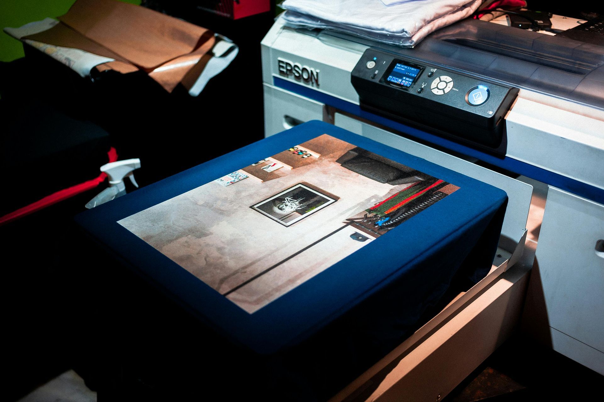
One of the most frequent issues is using images that look crisp on a computer screen but turn blurry and pixelated when enlarged. Large format prints require very high-resolution files to maintain clarity. Always provide original images at the highest resolution possible and avoid pulling graphics from the web. A professional printer can guide you on the ideal DPI (dots per inch) needed for your specific project size.
2. Poor Contrast and Color Choices
Even the most beautiful design will fail if people can’t read it easily. Low-contrast color combinations, such as light gray text on a white background, can disappear from a distance. Consider how your signage will look in different lighting conditions—daylight, shade, or artificial light—and use high-contrast colors that stand out. Test your design at scale to make sure it is easily readable.
3. Ignoring Viewing Distance
Following up on number two, when designing signage, think carefully about where it will be placed and how far away viewers will be. Text that’s legible from five feet away may be unreadable across a parking lot. Use large, bold fonts for headlines and keep copy minimal. As a rule of thumb, the farther away your audience, the simpler your design should be.
4. Overcrowded Design
Trying to include every detail—logo, tagline, phone number, website, and a list of services—can quickly clutter your layout. Visual overload reduces comprehension and impact. Focus on one clear message or call to action. Clean, uncluttered designs are more professional and more likely to be remembered.
5. Skipping Proofing Steps
Finally, never underestimate the importance of thorough proofing. Typos, misaligned elements, or incorrect colors are not only embarrassing but could be costly to fix after printing. Always review your proofs carefully and have at least one other person check them before final approval.
Avoiding these common mistakes when working on your next large format print will help you clearly communicate your message and reflect the quality of your brand. Of course, we highly recommend partnering with an experienced Houston printer who can guide you through each step of the process and create your project the way you have envisioned for it to be.