Crafting an Eye-Catching T-Shirt for Your Brand

Amber Hollier • May 16, 2024

Crafting an Eye-Catching T-Shirt for Your Brand

Creating a standout T-shirt design for your brand can feel overwhelming. It’s a process that combines aesthetics, branding, and marketing insights. For that reason, we’ve put together a few tips and tricks to keep in mind when designing your next promotional t-shirt below.


Understand Your Brand Identity

Before you start sketching designs, ask yourself:

  • What are the core values of your brand?
  • Who is your target audience?
  • What message do you want your T-shirt to convey?


Your T-shirt design should reflect these elements, remaining consistent with your overall brand identity.


Focus on Simplicity and Clarity


While it might be tempting to create a complex design, simplicity often has a stronger impact. A clean, straightforward design is more likely to be noticed and remembered. Busy prints can often times be too distracting and overwhelming for the viewer. Consider the following tips:

  • Limit Text: Use concise, impactful phrases or slogans.
  • Choose Bold, Clear Fonts: Ensure that any text is easily readable from a distance.
  • Simple Graphics: Opt for simple, striking graphics that support your brand message without overwhelming the design.


Use Colors Strategically

Color is a powerful tool in design, as it’s capable of evoking emotions and attracting attention. When choosing colors:

  • Brand Colors: Incorporate your brand’s color palette to maintain brand consistency.
  • Contrast: Use contrasting colors to make elements stand out.
  • Trends and Preferences: Consider current color trends and the preferences of your target audience.


Select the Right Typography

Here’s how to choose the right fonts:

  • Readability: Ensure the font is legible, especially from a distance.
  • Brand Consistency: Use fonts that align with your brand’s visual identity.
  • Hierarchy: Establish a clear hierarchy with different font sizes and weights to guide the viewer’s eye through the design.


Incorporate Your Logo and Branding Elements

Your logo is a key component of your brand’s identity. Integrate it seamlessly into your design:

  • Placement: Decide whether your logo will be the focal point or a subtle addition.
  • Size and Proportion: Ensure your logo is sized appropriately within the overall design.
  • Complementary Elements: Add elements like brand symbols or taglines that enhance the design without cluttering it.


Consider the T-Shirt Material and Color

The material and color of the T-shirt itself can have a huge impact on the overall design and aesthetic of your t-shirts:

  • Material: Choose a fabric that complements your design and offers comfort.
  • T-Shirt Color: Ensure the color of the T-shirt contrasts well with your design to enhance visibility.


Prototype and Gather Feedback

Before finalizing your design, create a prototype and seek feedback:

  • Mockups: Use digital mockups to visualize your design on a T-shirt.
  • Feedback Loop: Gather opinions from team members, potential customers, or focus groups to refine your design.


Test Print Quality

Print quality can make or break your design. Ensure that:

  • High-Resolution Graphics: Use high-resolution images and vectors.
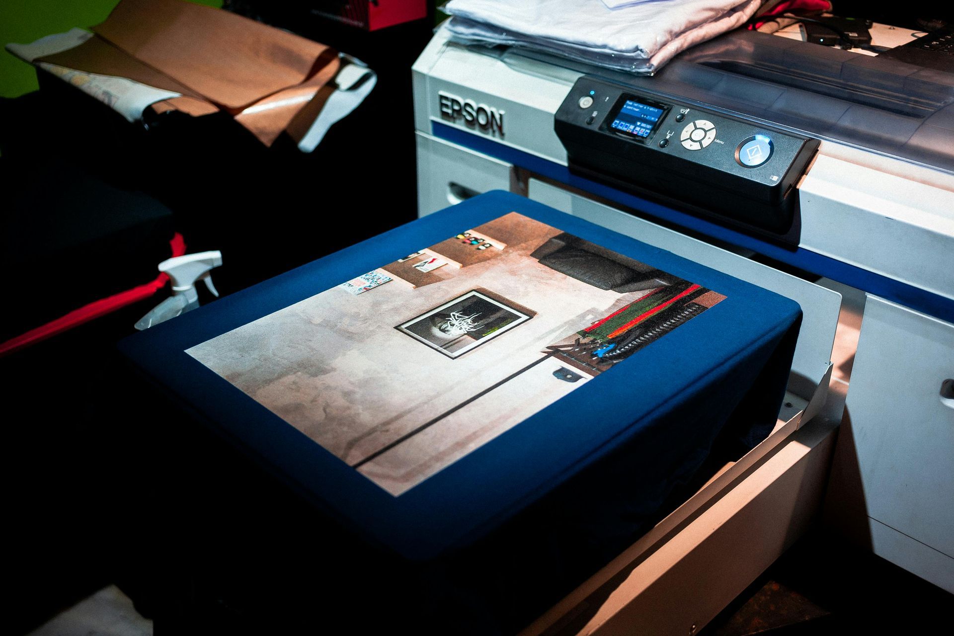
  • Print Methods: Choose the right printing method (screen printing, DTG, etc.) that suits your design and budget.


Remember, the key to a successful T-shirt design lies in the perfect blend of creativity, brand alignment, and strategic planning. Triangle Printing and Marketing has successfully printed thousands of shirts for our clients for any occasion you can think of! We also have an in-house graphic designer to aid in the design process of your next promotional t-shirt campaign if you’re feeling over whelmed. Give us a call to discuss more!
By Amber Hollier April 28, 2025
Print marketing is at times overlooked as our digital landscape continues to grow. However, it remains a powerful and measurable tool when used appropriately and with a plan. In many cases, it’s the catalyst that moves a customer to convert. Understanding when and where it can have the greatest impact is the best place to start. Top of Funnel: Building Awareness At the awareness stage, your goal is to put your brand on the map. Printed mediums grab the attention of your potential customers and are often times a customers’ first impression of your brand. Use Case: Door Hangers and EDDM (Every Door Direct Mail) Targeting by geography, print offers something digital can’t— guaranteed visibility in the home. Door hangers, for example, are placed directly on the doorknob, requiring physical interaction. EDDM campaigns are highly effective for hyperlocal businesses looking to introduce themselves to a new neighborhood.  Use Case: Event Banners and Large Format Signage Trade shows, pop-up shops, and community festivals are all opportunities to increase your brand visibility. A well-designed retractable banner or table throw gives your business credibility and creates visual interest. Middle of Funnel: Nurture and Engagement Once a potential customer is aware of your brand, you want to keep them engaged. This stage is about providing value and reinforcing your brand's trustworthiness. Do not underestimate the power of high quality print materials contribution to this stage. Use Case: In-Store Brochures and Catalogs At the point of sale or customer service desk, brochures offer a way to deepen product understanding without requiring staff time. Printed catalogs let customers browse at home, keeping your brand in a customer’s field of vision for impressions to be made long after the initial interaction. Use Case: Educational Print Materials Industries like healthcare, financial services, and B2B consulting benefit from printed whitepapers, infographics, and educational mailers. These pieces show thought leadership while also functioning as high-value leave-behinds after meetings or seminars. Bottom of Funnel: Conversion and Retention Here’s where many businesses assume digital tools are their only option. But print can be the finishing touch that drives a decision—or re-engages a quiet lead. Use Case: Re-Engagement Direct Mail Campaigns For customers who haven’t responded to emails or clicked on ads, a direct mail piece with a compelling offer or personalized message can reignite interest. Include a QR code or personalized URL (PURL) to track response and measure impact. Use Case: Personalized Thank You Cards and Loyalty Mailers After a sale, a printed thank-you card or follow-up mailer with a discount code feels personal and thoughtful. It also increases the chance of repeat business—especially if it arrives a week or two after a purchase, when satisfaction is at its peak. Why It Matters Print may not offer instant metrics like email open rates, but that doesn’t mean it can’t be measured. By integrating QR codes, tracking phone numbers, or custom landing pages, print’s impact can be analyzed just like digital. Businesses that embrace this hybrid approach stand to gain a competitive edge. Creating print touchpoints with each stage in your marketing funnel makes for a more memorable and measurable customer journey.
By Amber Hollier April 8, 2025
When you think about your printed marketing materials—whether it's a brochure, a direct mail piece, or product packaging—your mind likely goes straight to design, layout, and color. But there’s one element that silently shapes how your audience feels about your brand the moment they touch it: the paper. The texture and weight of your paper play a subtle yet powerful role in how people perceive your business. It's not just about how your materials look, but how they feel—and that feeling can shape trust, credibility, and brand loyalty. Why Touch Matters in Marketing Touch is one of the most immediate and emotional human senses. Studies have shown that physical contact with an object creates a stronger emotional response than visual input alone. When someone picks up a printed piece, their brain immediately begins forming opinions about its quality and purpose—often before they even read a word. This is where your paper choice becomes a quiet but influential part of your message. A heavy, textured card stock communicates something very different than a lightweight glossy flyer. The feel in the hand becomes a reflection of your brand’s quality. What Texture Says About Your Brand Let’s look at how different paper textures influence perception: Glossy finishes offer a sleek, polished feel—great for brands that want to appear modern and professional. They're commonly used in tech, real estate, and lifestyle catalogs. Matte finishes feel soft and understated. They’re often associated with minimalism, sophistication, and a high-end tone. Textured stocks like linen or felt suggest tradition, warmth, and trust. Perfect for law firms, universities, and nonprofits. Soft-touch coatings provide a luxurious, velvet-like feel that immediately lifts brochures, packaging, or invitations into something memorable. In short, texture communicates emotion. It helps bridge the gap between the message you’re sending and how your audience receives it. The Weight Behind the Words Weight matters too—literally. The thickness and sturdiness of your paper signal how much thought, value, and permanence you’ve invested in your message. Heavier stocks imply quality, substance, and care. A thick brochure or business card feels serious and dependable. Lighter paper is more cost-effective and may be appropriate for temporary or disposable materials, like event handouts or promotional inserts. The goal is to choose a paper weight that reflects your intent. A luxury brand’s printed catalog should feel premium, while a seasonal flyer for a weekend sale doesn’t need to feel like a hardcover book.  Smart Pairings: Paper That Matches Your Message Here’s how some brands can use paper psychology to their advantage: A nonprofit organization might print an impact report on textured, uncoated stock to convey authenticity and transparency. A health & wellness brand could choose soft-touch coating to evoke calmness and care. A high-tech startup may opt for sleek gloss paper that reinforces innovation and clarity. When the paper matches the message, your printed materials work harder for you—silently reinforcing your brand identity. Print That Feels as Good as It Looks At Triangle Printing and Marketing, we believe the most effective printed pieces are the ones that engage all the senses. We help businesses choose paper textures and weights that align with their audience, goals, and budgets. Thoughtful materials speak volumes. Whether you're printing brochures, mailers, packaging, or signage, don’t overlook how your paper feels. That feeling could be what earns a second look, a stronger impression, or even a loyal customer. Want to explore your paper options? Let’s talk about your next project. Contact us for a paper consultation.
By Amber Hollier March 6, 2025
Banner Stands & Frames: The Best Display Options for Various Settings